In 2015, Tesco launched a new digital platform called LEGO to the 12 countries in Europe and South Asia. Toni joined the UX team and worked on convergence of international platforms. The goal was to make measurable improvement on checkout journey, whilst transforming the platform to the UK market.
Insights
Frozen check out pages are the biggest shopping stressor as much as long queues at stores.
Research uncovered the main causes of stress for UK customers when shopping online. 76% participants said they experienced high levels of stress when a shopping app freezes during check out. This rose to 82% for those shopping via a web browser.
Discount codes failing at the check out were the UK’s second biggest online shopping stressor. 80% of consumers were also under high levels of stress when their online vouchers are declined.
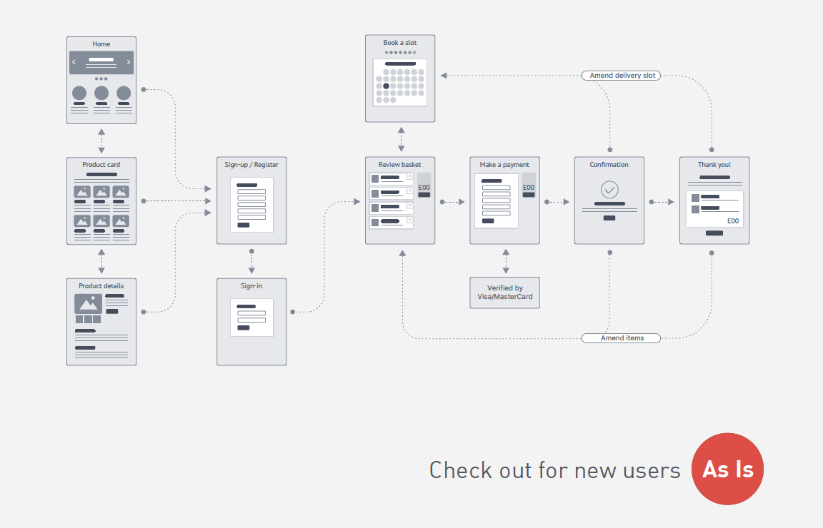
Check out flows from reviewing a basket to picking a delivery slot. Micro interactions were designed for coupon redemption before users reach to payment transaction.

Challenge
User experience on mobile web versus native app.
UX patterns on a mobile web were behaving like a native mobile app. That could be a challenge to build responsive UI components for different viewports.
On LEGO we carried a consistent information hierarchy across all sizes of screens. It doesn’t need extra effort for users to learn how it works on smaller devices.
Promotion landing page layout from top to bottom shows:
• Header
• Search and basket
• Primary navigation
• Page heading
• Secondary navigation
• Product tiles
Mobile web on old stack
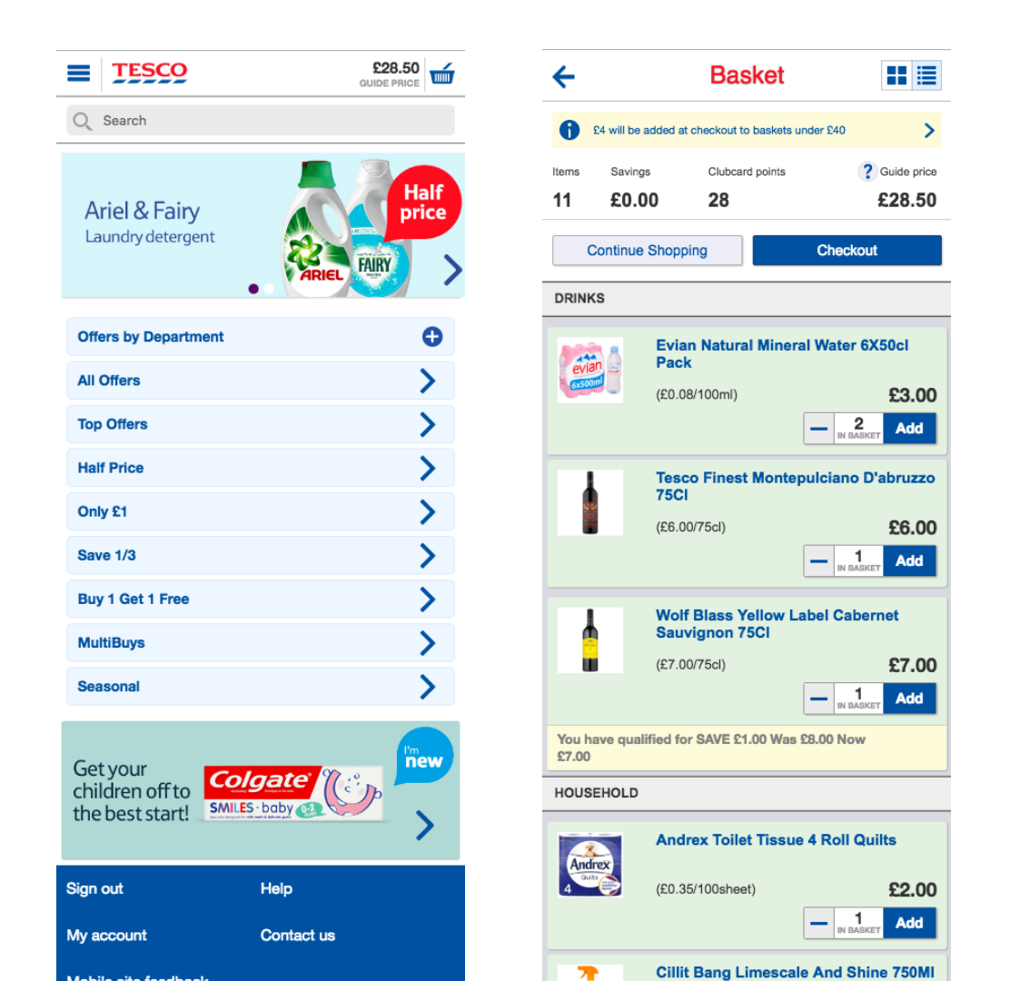
Fluid layout on LEGO (new platform)
Mission
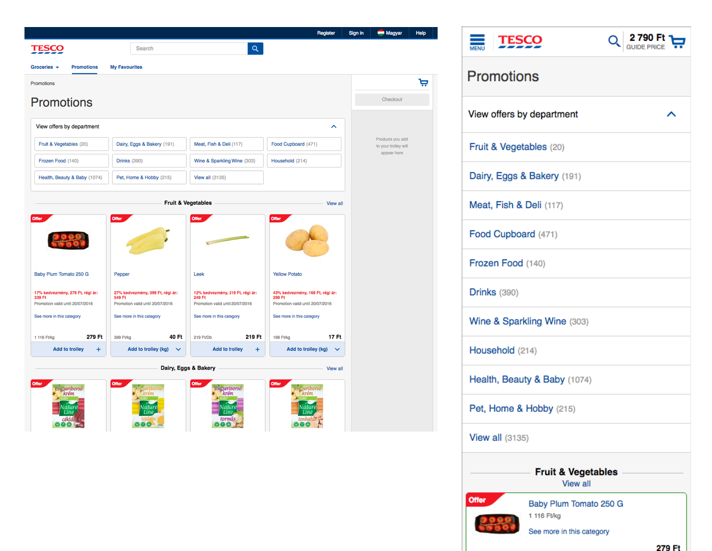
Build scalable, resilient and flexible UI compenents.
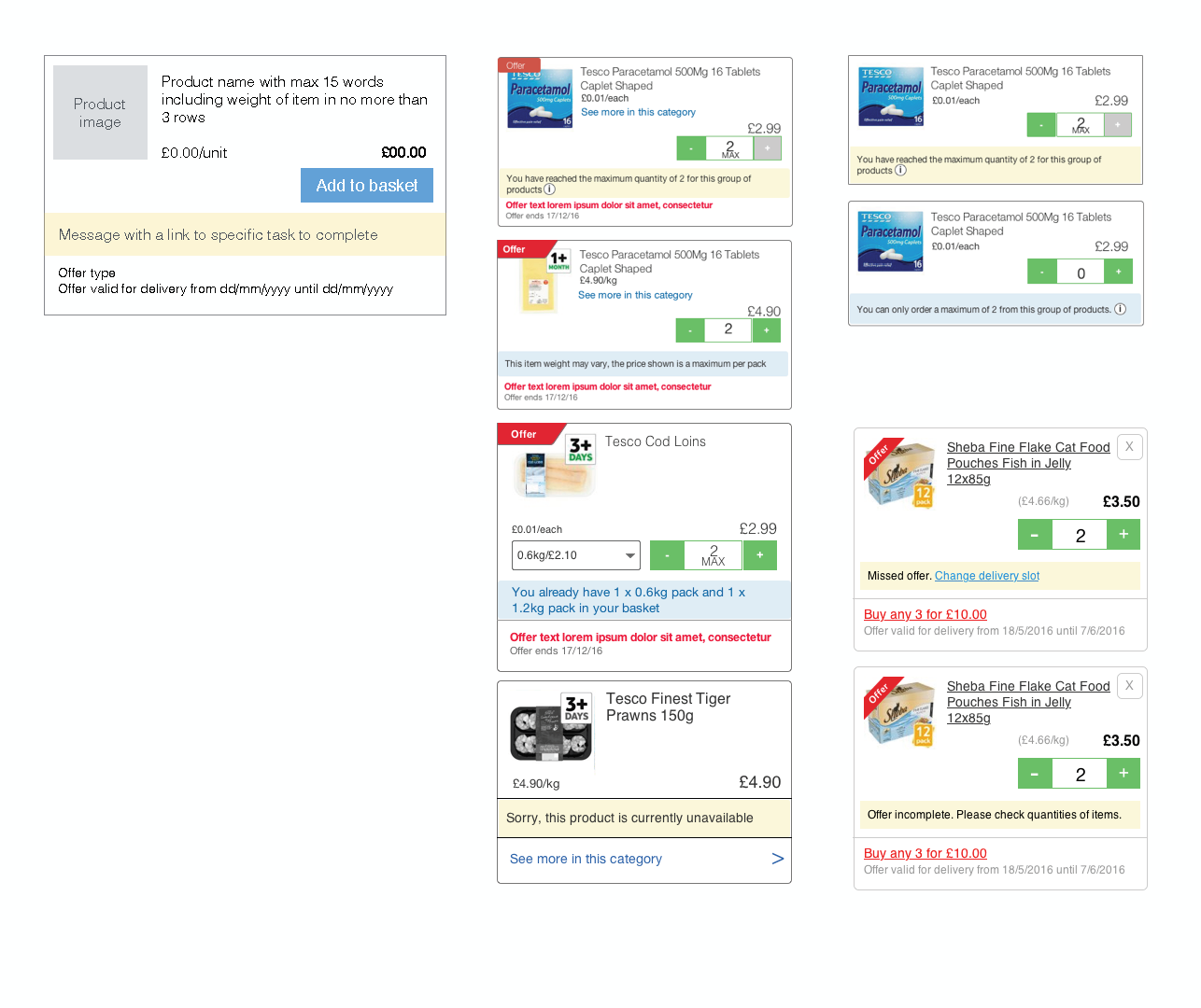
UI components in the new checkout journey are scalable. They don't need repositioning for every single resolution. The layout is logical and fluid. It means that UI library can be maintained with less effort of design and development. They are build to be flexible for the growing number of devices in the future.
Resilient system can be built when the design is simple, passive, and flexible. LEGO UI is stable yet resilient enough to remain functional in unexpected circumstances. It's because the simplicity and scalability are in its design framework.
Order summary messaging component in a check out journey
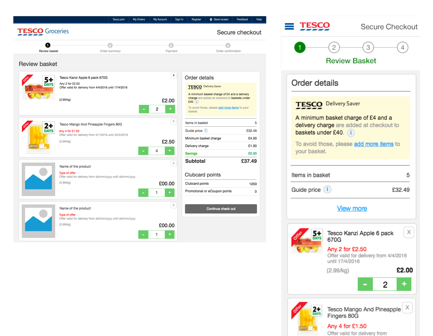
Task based messaging component in product tiles
What's next
Explore internal navigations – filter and sort components.
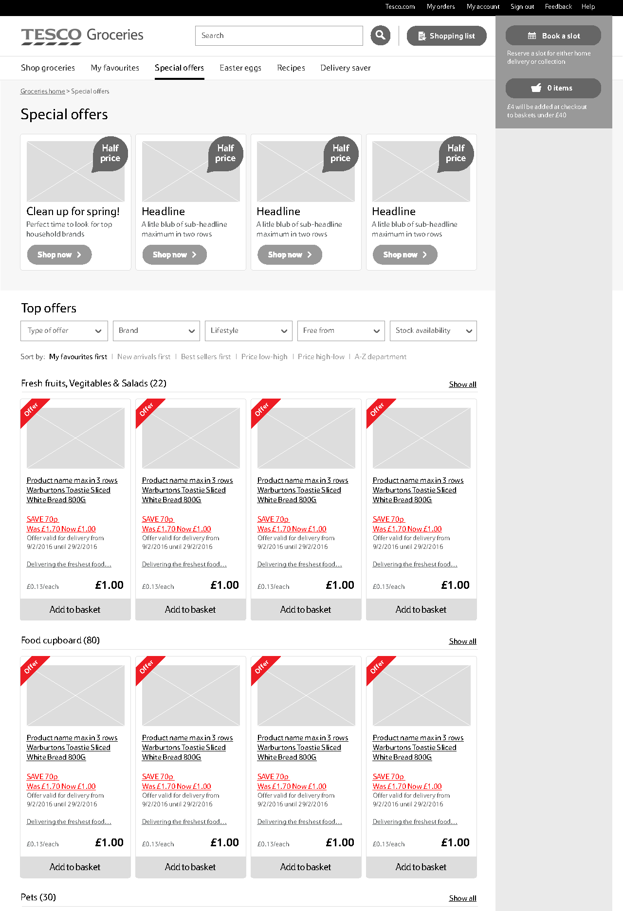
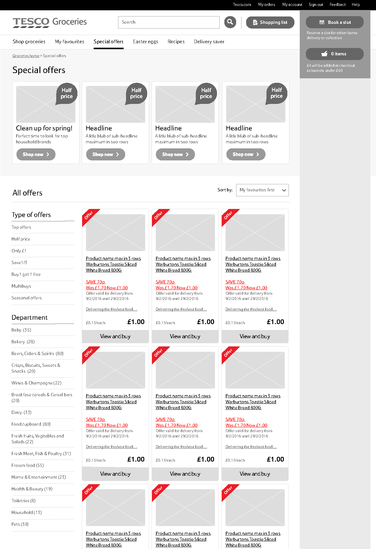
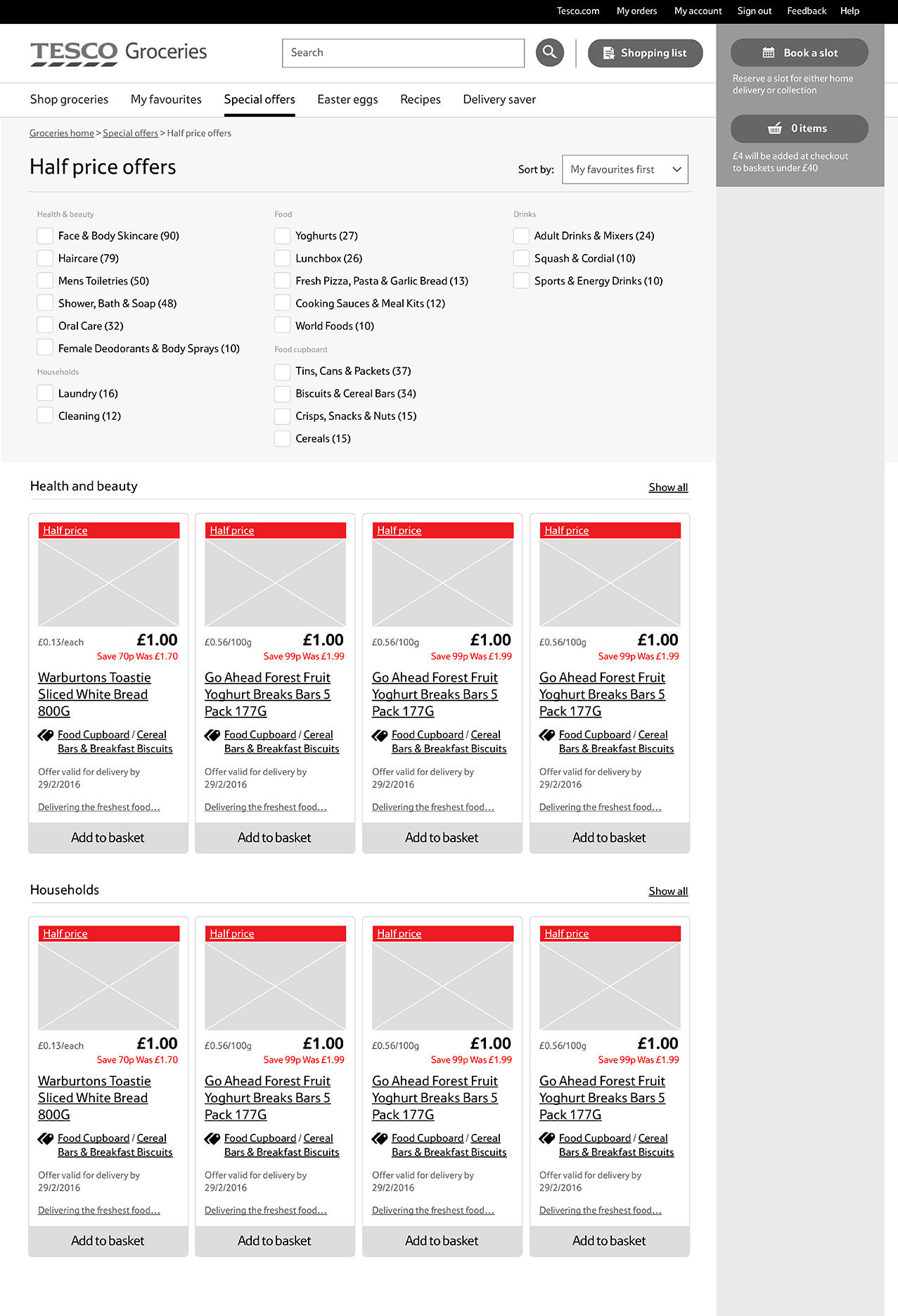
There was a huge opportunity to explore internal navigations. Customers might want to use filters to narrow down what they are looking for. For example, lifestyle based filter to view only 'Free from' products would be a faster way for users to find what they need.
How might we serve those customers who want to filter and sort items to find what’s in their mind quicker and easier?
Horizontal dropdown category filters
Left-hand side category filters
Dynamic check box filters
Copyright ©SingBlue 2019. All rights reserved.
